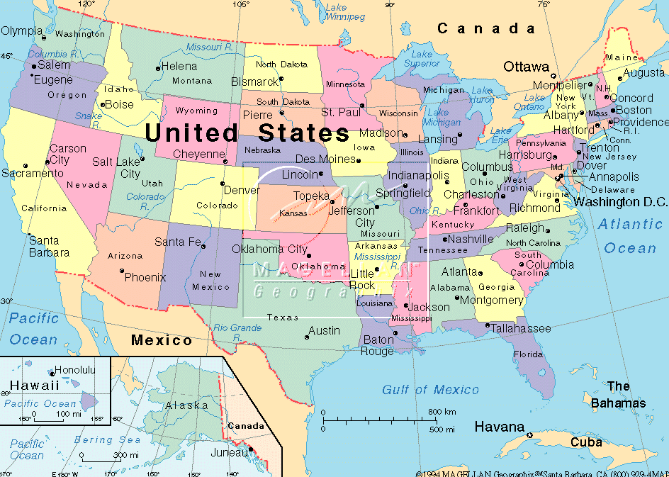
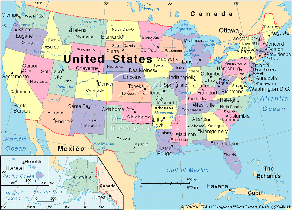
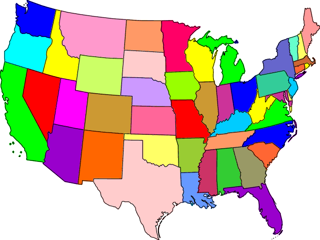
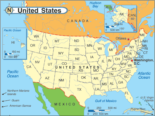
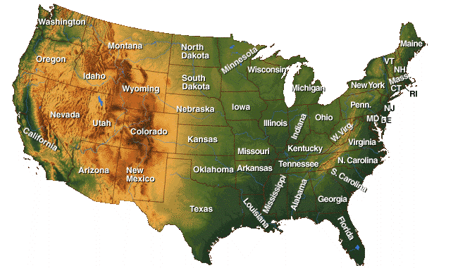
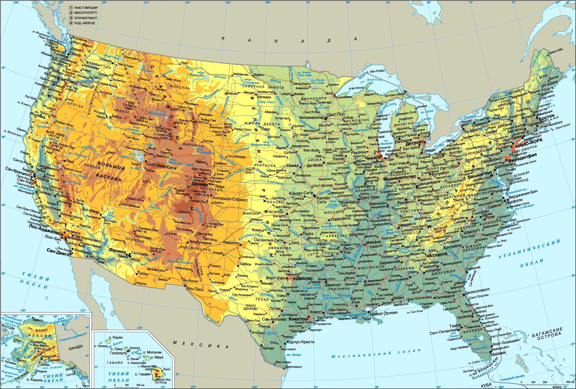
United States Population Density Map
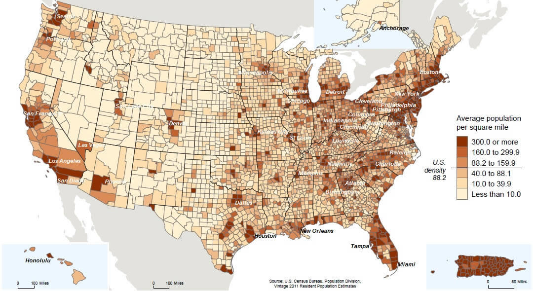
The US population density map uses color-coding to indicate population density, with darker colors representing higher population density. The map shows that the eastern and western coasts, as well as some major cities, have higher population densities than other areas of the country.
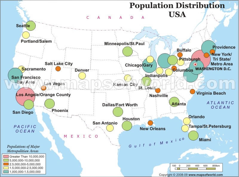
There are also some pockets of high population density in other regions, such as around Massachusetts, Connecticut, Maryland, Maryland, Delaware, New York, Florida, Pennsylvania, Ohio, California, Illinois, Hawaii, Virginia, North Carolina, Indiana, Georgia, Michigan.
The US population density map provides a visual overview of population distribution across the United States, highlighting areas with high and low population concentrations. This map, useful for understanding demographic trends, shows densely populated regions such as the East Coast and parts of California. With the 2023 data, it gives insight into how people are spread throughout the country, illustrating the contrasts between urban hubs and rural areas. This population map of the US serves as an informative resource for anyone interested in the latest demographic patterns and population density insights across various states and cities.
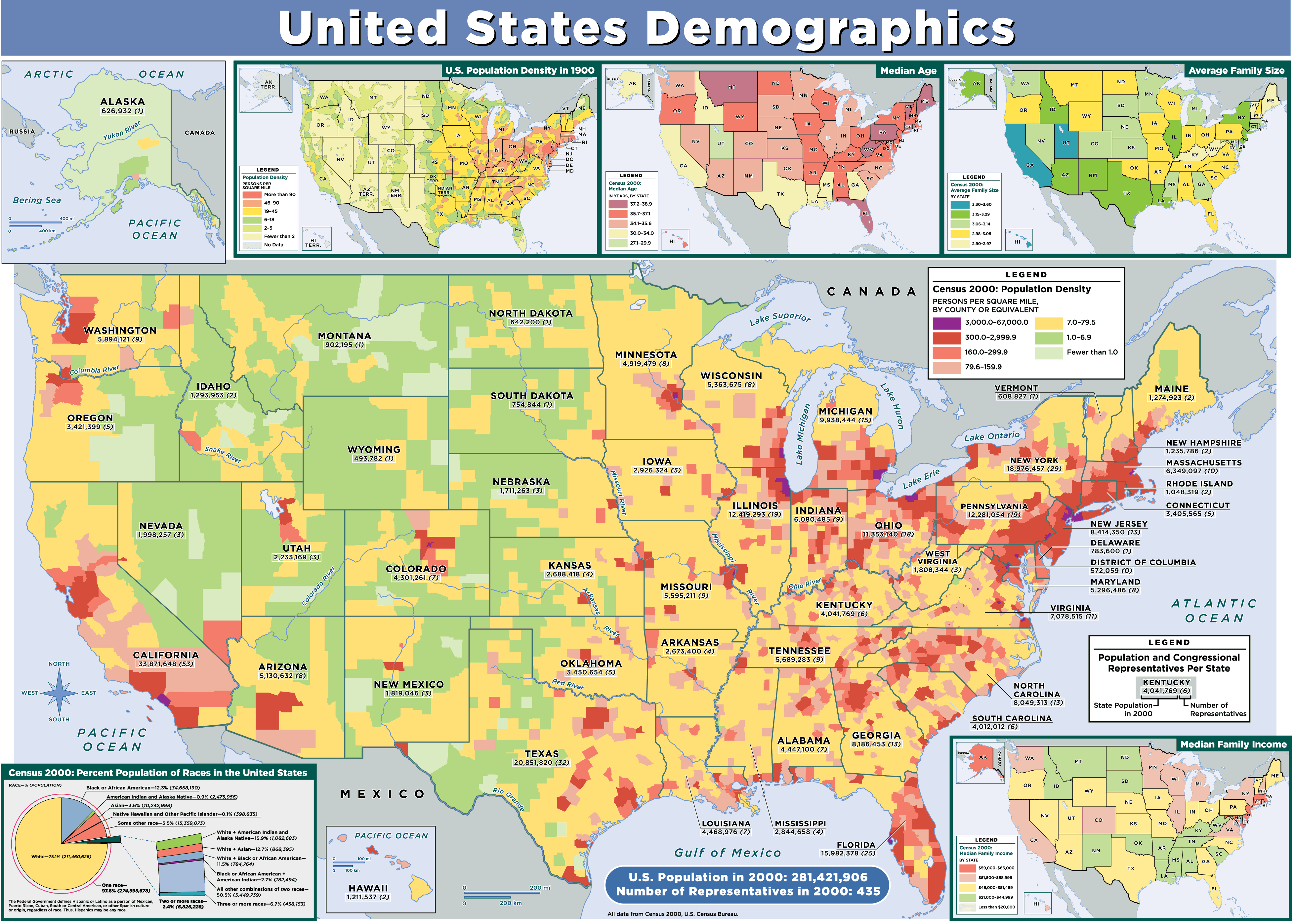
Population Density Map of the United States in 2000 by County
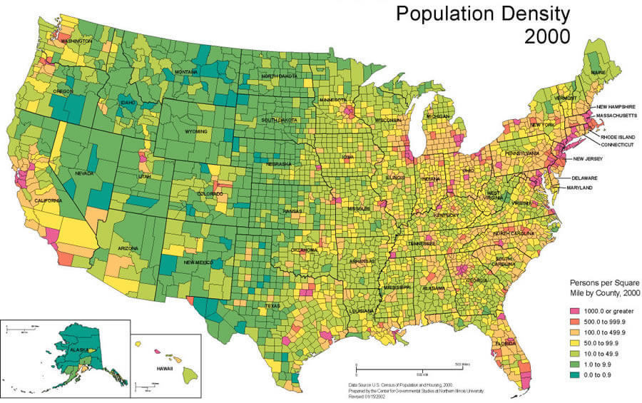 Population density map of the United States by county in the year 2000.
United State Population Density Map
 USA Population Density Map
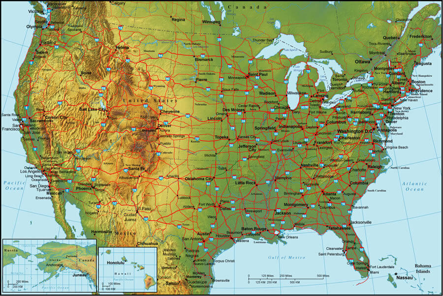
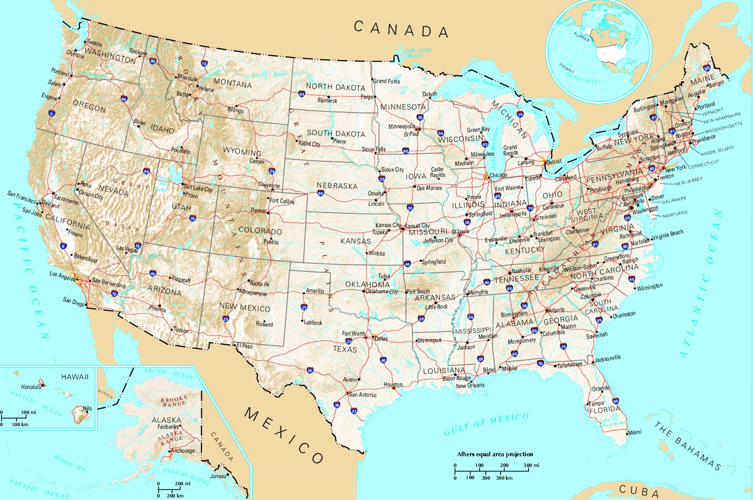
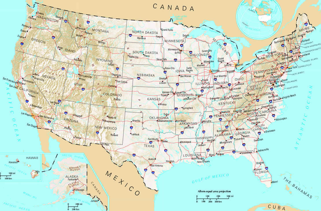
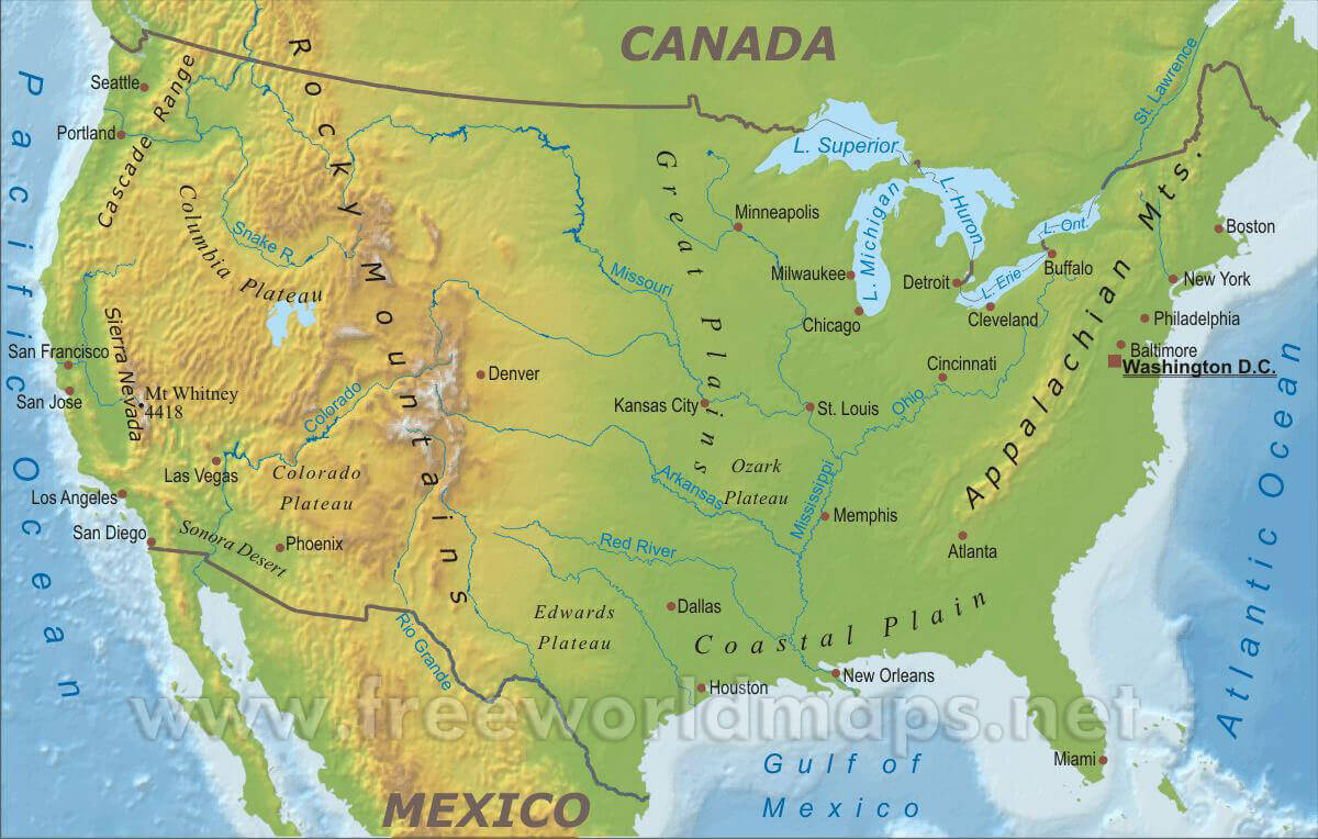
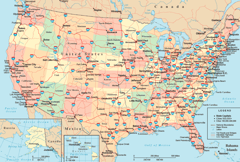
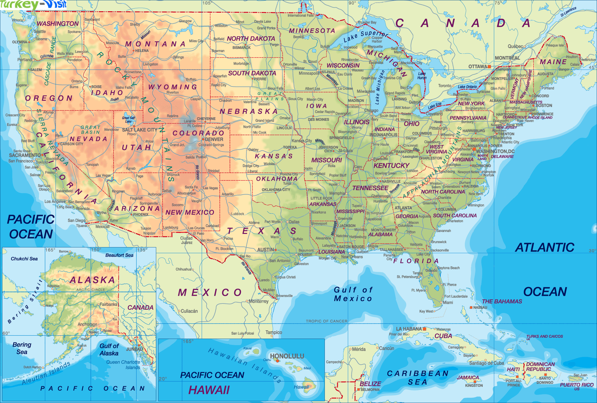
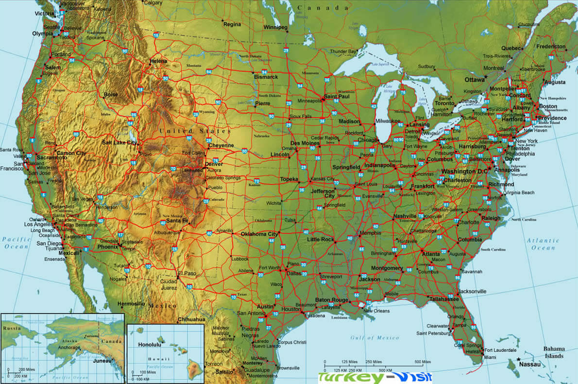
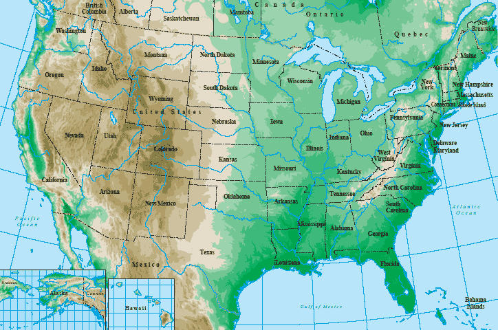
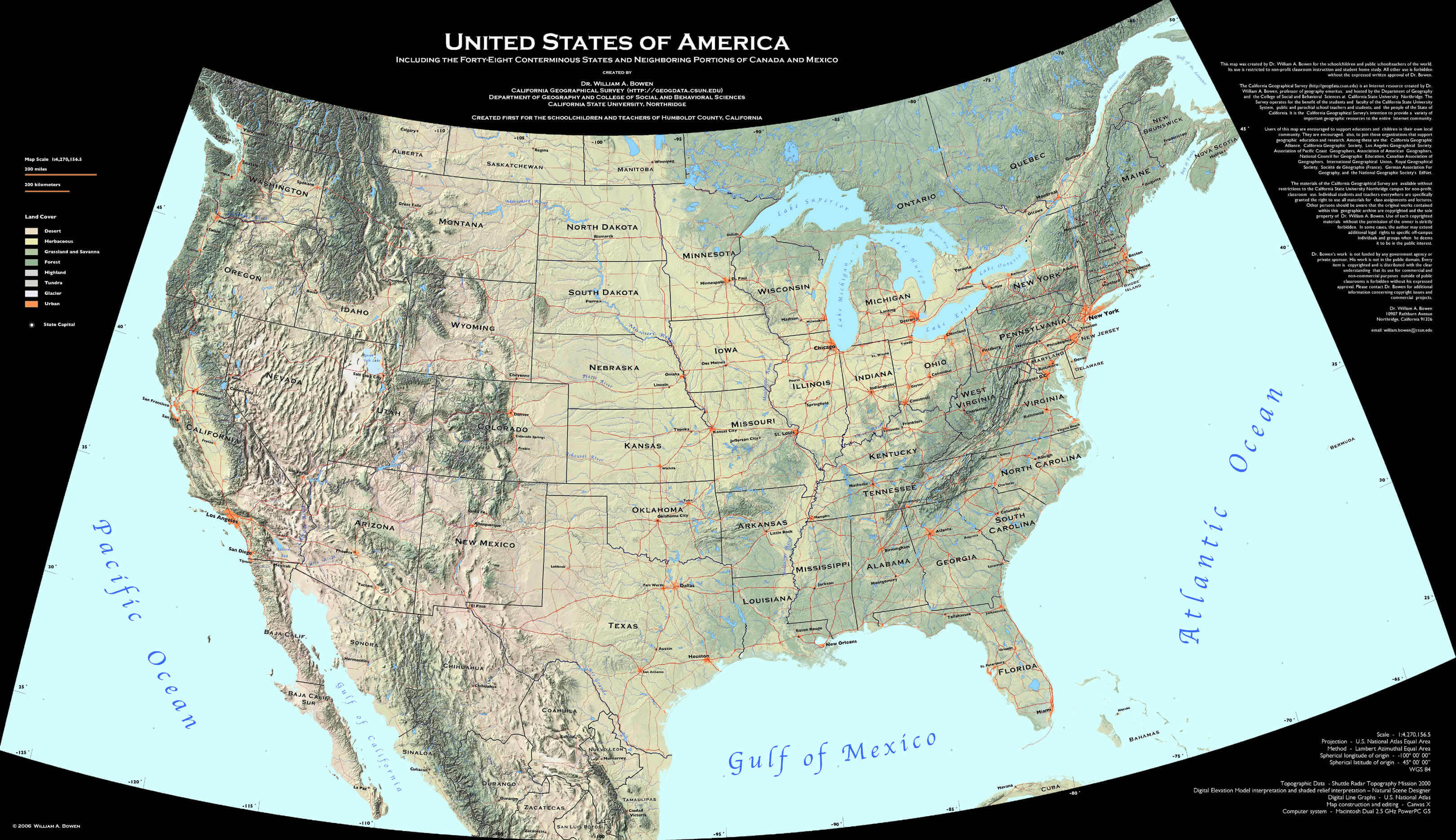
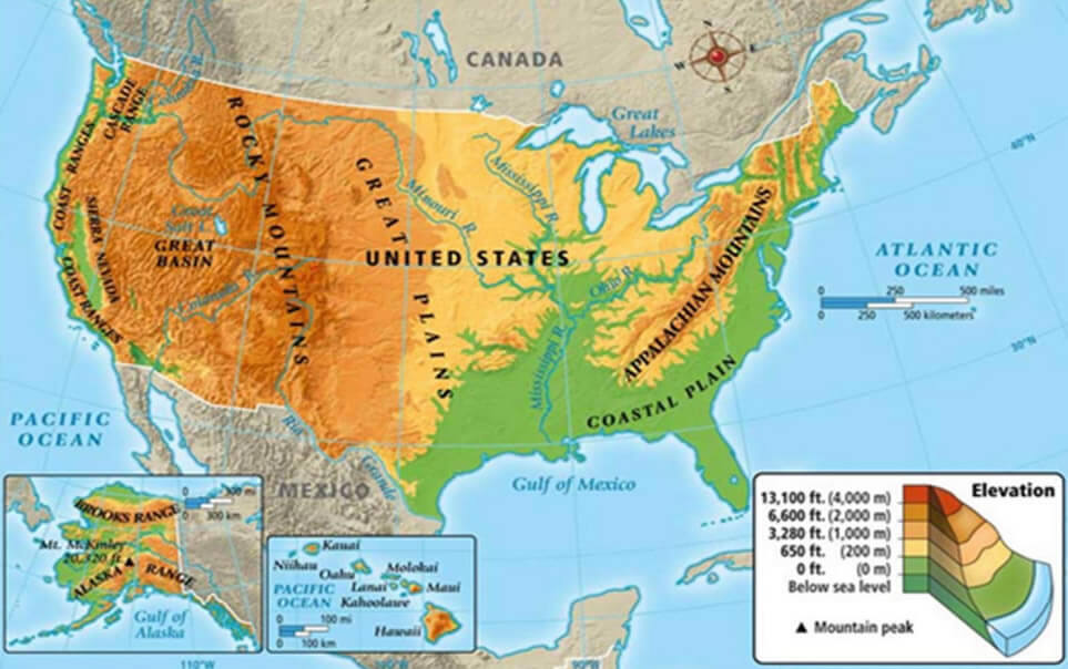
Topographic and Population Density Map of the United States
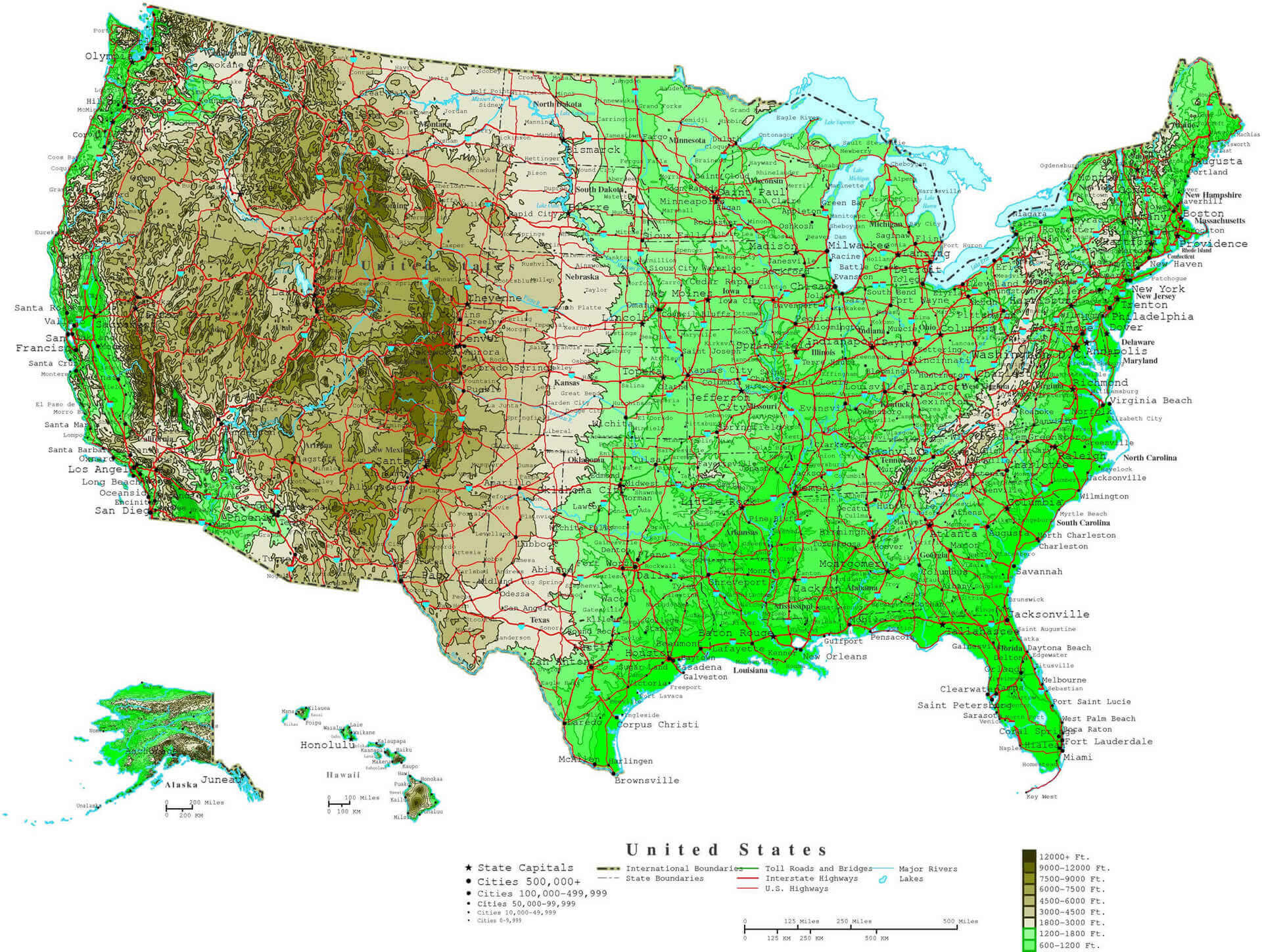 Topographic map of the United States showing population density and major highways.
2018 Population Density Map of the United States
 2018 U.S. population density map by county, showing density in persons per square kilometer.
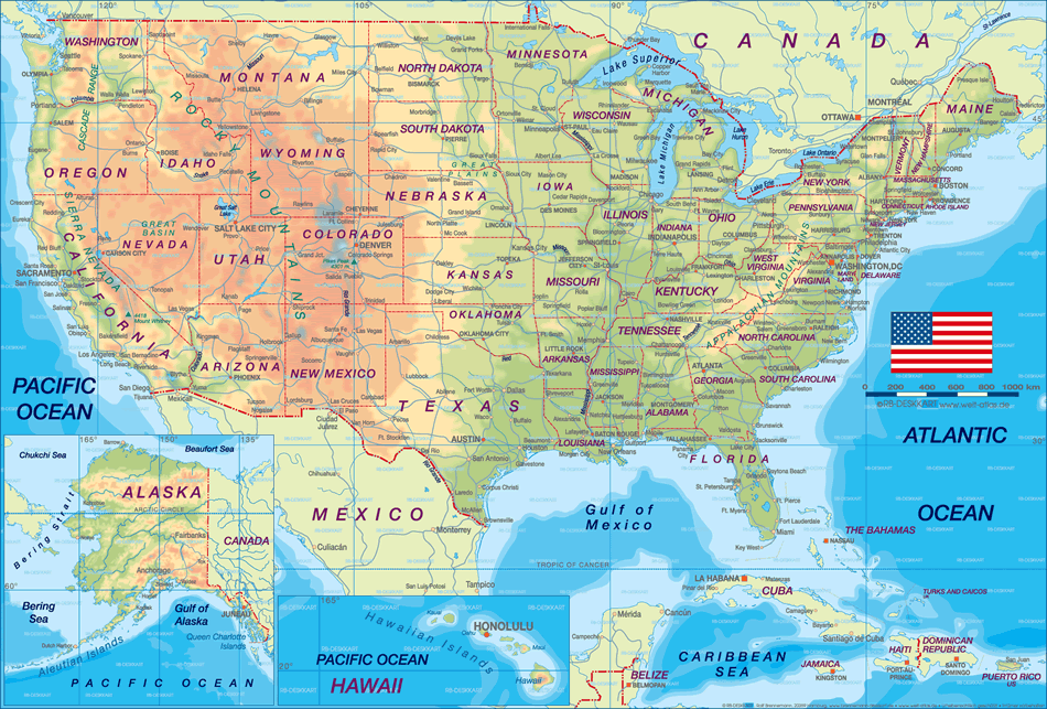
Population density in the U.S. by federal states
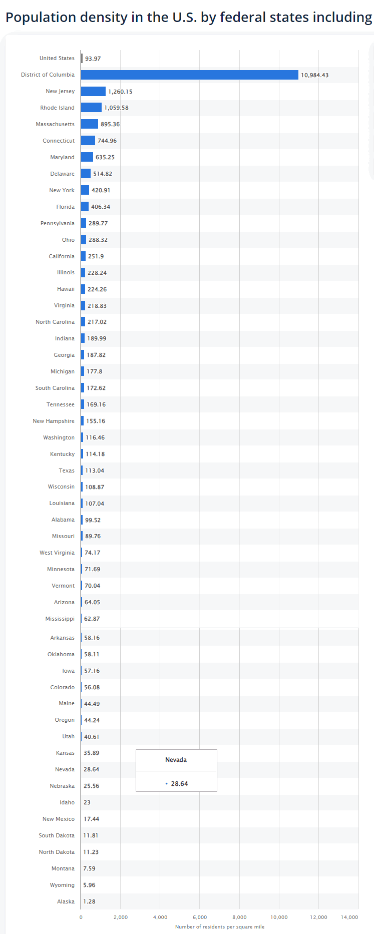
Population Density Map by U.S. States in 2020
 2020 U.S. population density map by state, shaded in blue tones by persons per square mile.
US States and Counties Population Density Map
 U.S. population density map by county, shaded in blue tones by population size.
US Population Density Map
 U.S. population density map by county, shaded from green to red by density per square mile.
The population density of the US is lower than that of many other countries because of the United States' large land area. The population density of the U.S. is 1/15 that of South Korea and 1/12 that of India and the Netherlands. On the other hand, it is over 8 times higher than that of Canada and over 9 times higher than that of Australia.

Brief information about Italy
The United States, with a population of over 330 million, is one of the most populous countries in the world, behind only China and India. Its population is extremely diverse, with people of various ethnic backgrounds, including European, African, Asian and Latin American, reflecting a rich history of immigration. The country occupies a large geographical area in North America, from the Atlantic Ocean in the east to the Pacific Ocean in the west, encompassing a variety of climates, cultures and landscapes that contribute to its distinct regional identities.
 Golden Gate Bridge, San Francisco, California - United States
Founded in 1776 with the signing of the Declaration of Independence, the United States became a nation after gaining independence from British colonial rule. Throughout its history, it has experienced rapid growth and expansion, marked by key events such as the Civil War, which ended slavery, and the Civil Rights Movement, which pushed for racial equality. Today, the US is home to a wide range of ethnic groups, with white Americans being the largest ethnic group, followed by Hispanic, black and Asian communities. English is the primary language, although Spanish is also widely spoken. Religion plays an important role, with Christianity being the dominant faith, although the country is also home to practitioners of Judaism, Islam, Hinduism, Buddhism and many other religions, reflecting its freedom of religion.
The capital of the United States is Washington, D.C., on the east coast. However, New York City is the largest city by population and serves as a global financial and cultural centre. The US economy is the largest in the world, driven by a mix of technology, finance, healthcare and entertainment. Its economic strength is reflected in its role as a leader in global trade, technological innovation and finance. The US dollar is the world's most important reserve currency, and American companies such as Apple, Microsoft and Google are among the most influential in the world. Despite economic challenges, the country remains one of the world's most powerful economies, with a high GDP per capita and a dynamic workforce.
Where is located the United States on the World Map
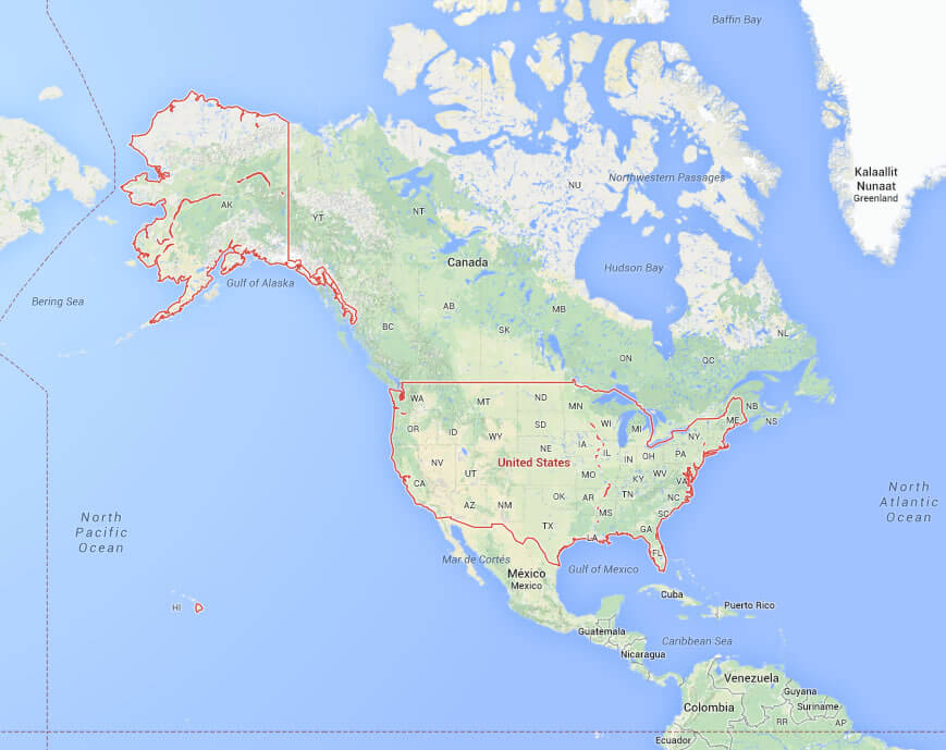
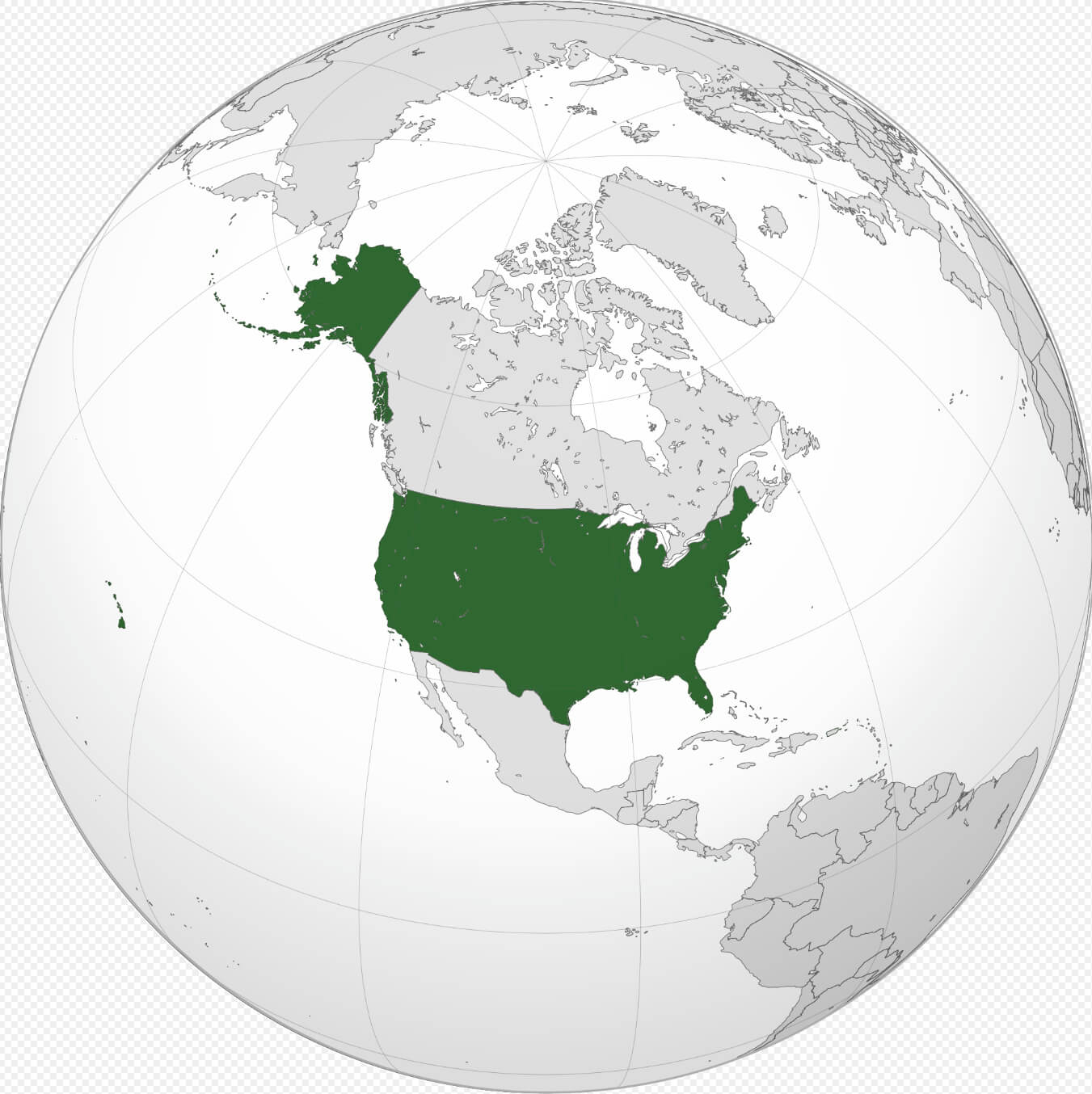 Where is the United States on the World Map
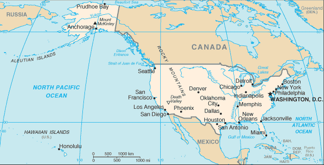
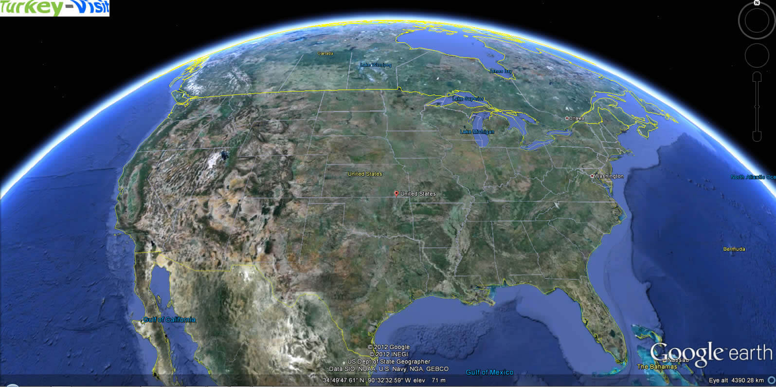
The United States is located on the continent of North America, between the Atlantic Ocean to the east and the Pacific Ocean to the west. It shares its northern border with Canada and its southern border with Mexico, and covers a vast geographical area from the Arctic in Alaska to the tropical climate of Hawaii. The mainland lies between approximately 24° and 49° north latitude and 66° and 125° west longitude. The US also has several territories, including Puerto Rico in the Caribbean and Guam in the Pacific, which extend its reach beyond the mainland.
On the world map, the United States is located in the Western Hemisphere, mainly in the North American region. Alaska, the largest state in terms of area, lies to the north-west of Canada and is closer to Russia than to the continental U.S. Hawaii, on the other hand, is an archipelago in the central Pacific, far south-west of the U.S. mainland. The country's vast expanse and multiple time zones, from Eastern to Pacific, underscore its geographic diversity and influence, stretching nearly 3,000 miles (4,800 kilometres) from coast to coast. This positioning makes the US a strategic location for international trade and travel, with close links to both Europe and Asia.
Here are some statistical information about the United States:
Area: 3,796,742 sq mi (9,833,520 km2)Population Growth In The United States (1790-2024)
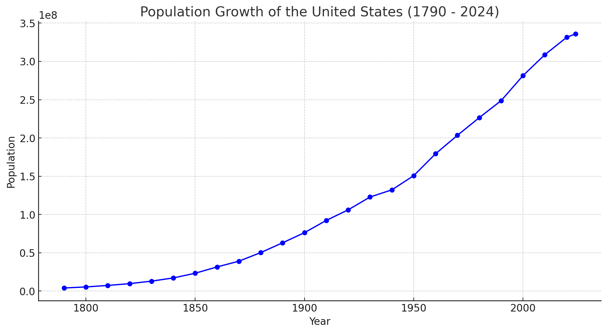 <
Population Growth In The United States (1790-2024)
<
Population Growth In The United States (1790-2024)US Ethnic Demographic Composition (2020)
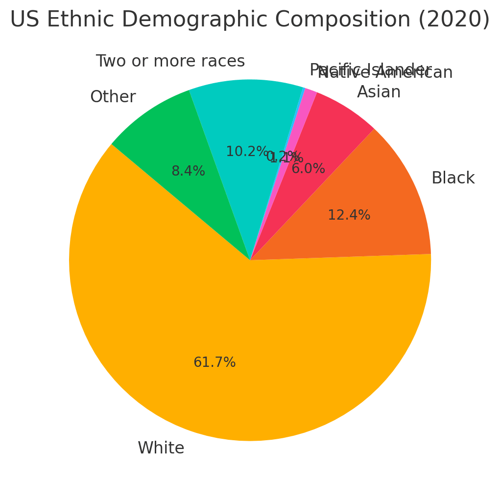 US Ethnic Demographic Composition (2020)
Religious Composition Of The USA (2023)
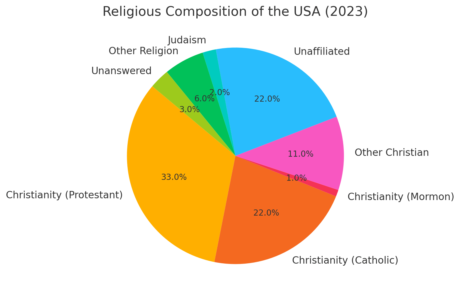 Religious Composition Of The USA (2023)
Population Density Map of the United States by County
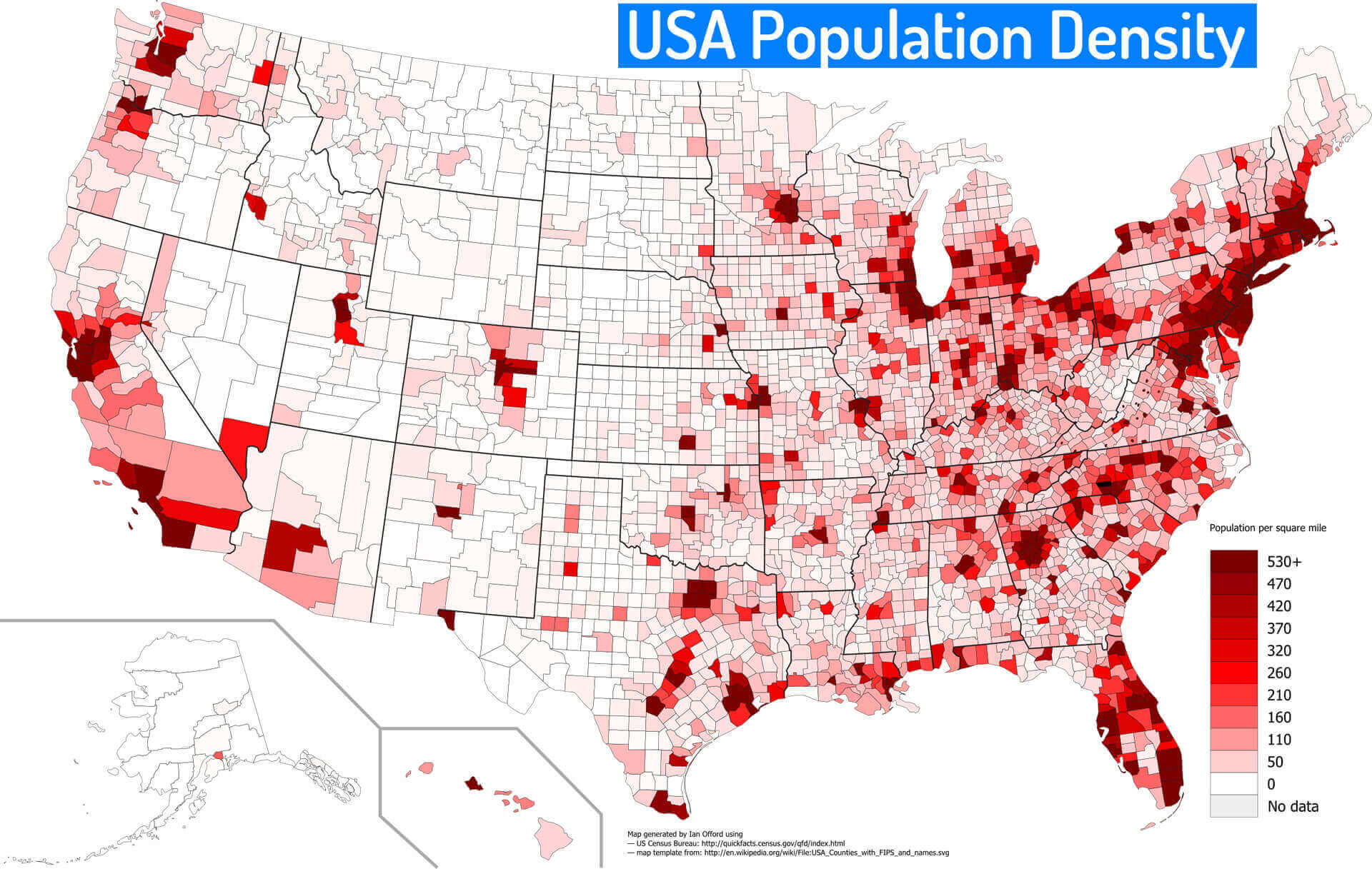 U.S. population density map by county in shades of red, based on persons per square mile.
Global Population Density Map (2023)
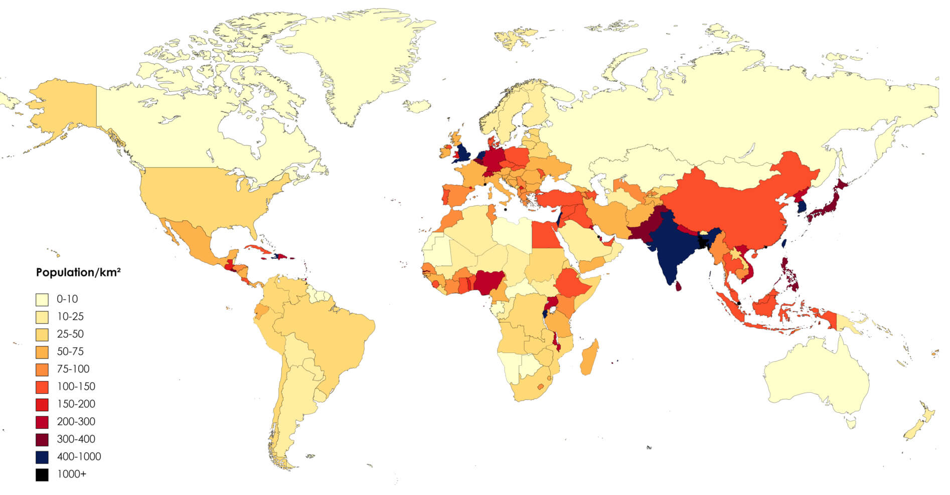 2023 world population density map by country, showing population per square kilometer.
U.S. Population Under Age 5 by County (2020)
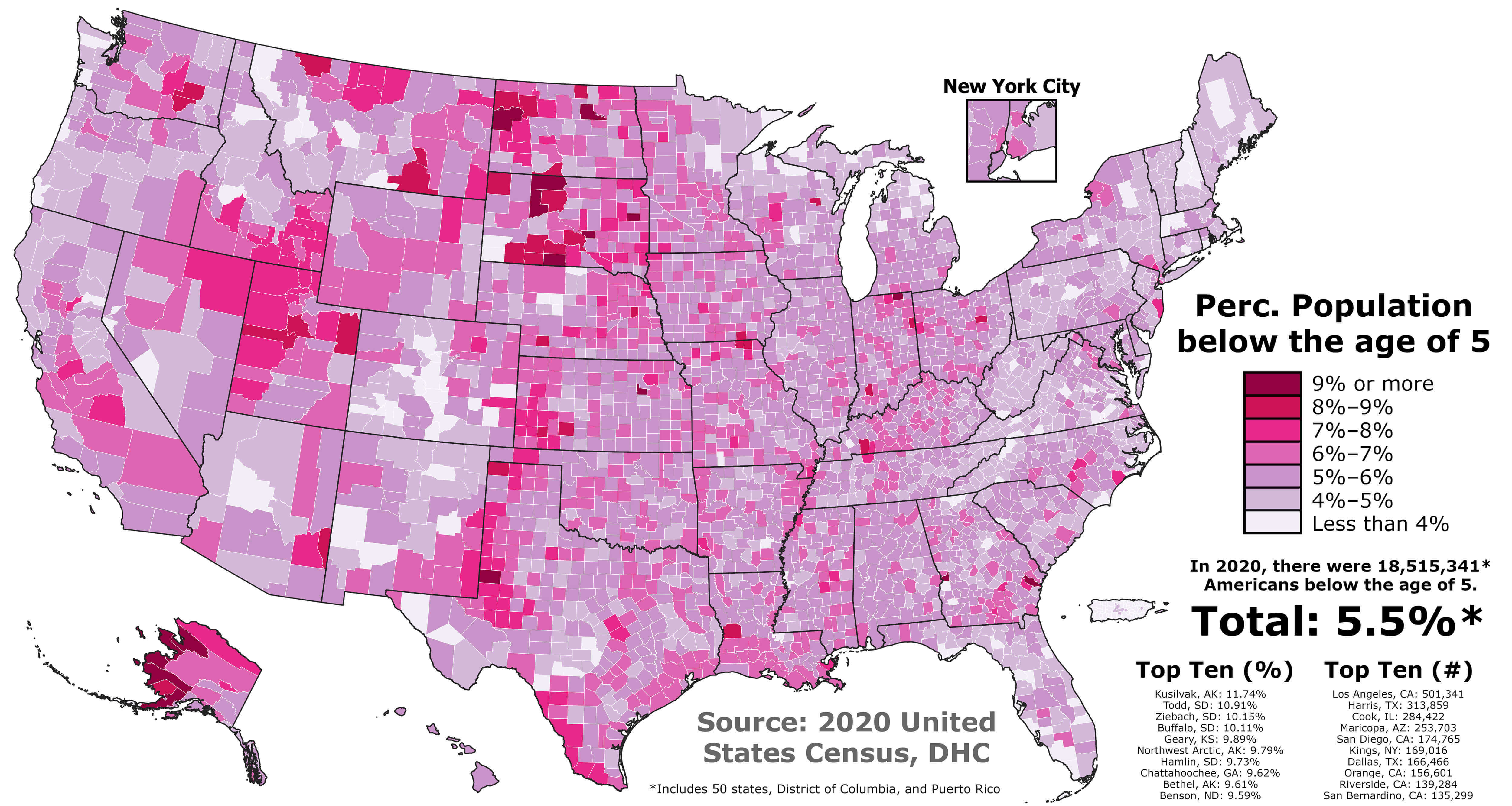 Map of U.S. population under age 5 by county in 2020, shaded from light to dark pink.
World Countries and United States Population Density Map by Country and Region (1994)
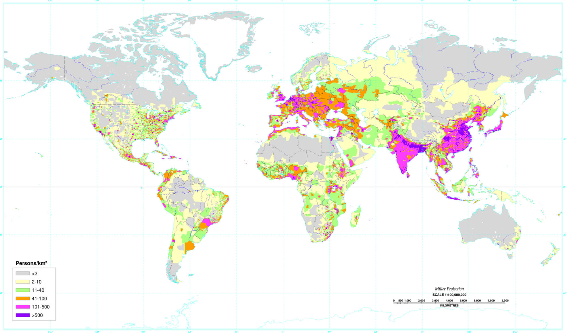 1994 world population density map showing density by country and U.S. regions.
U.S. Population Density Change by County (1990 - 2022)
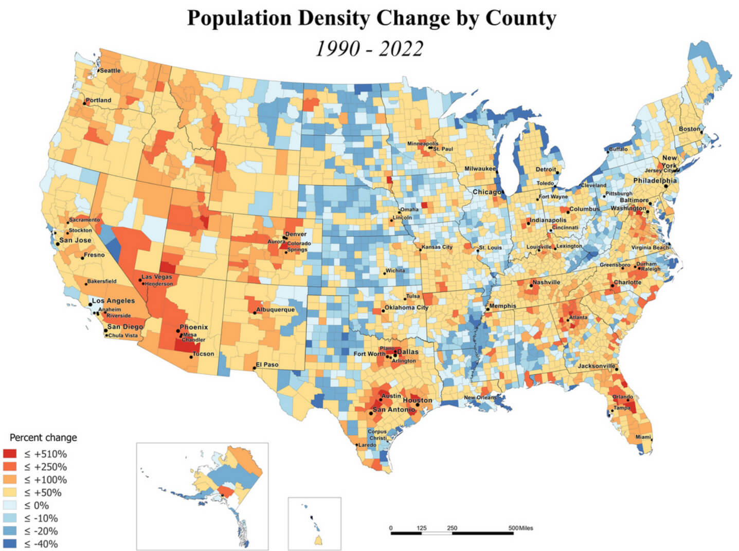 Map showing population density change in U.S. counties from 1990 to 2022 in color scale.
Population Density of U.S. States (2023)
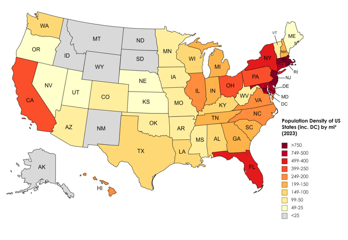 2023 U.S. population density map by state, color-coded from low to high density.
U.S. Population Density Heat Map (2000 - 2020)
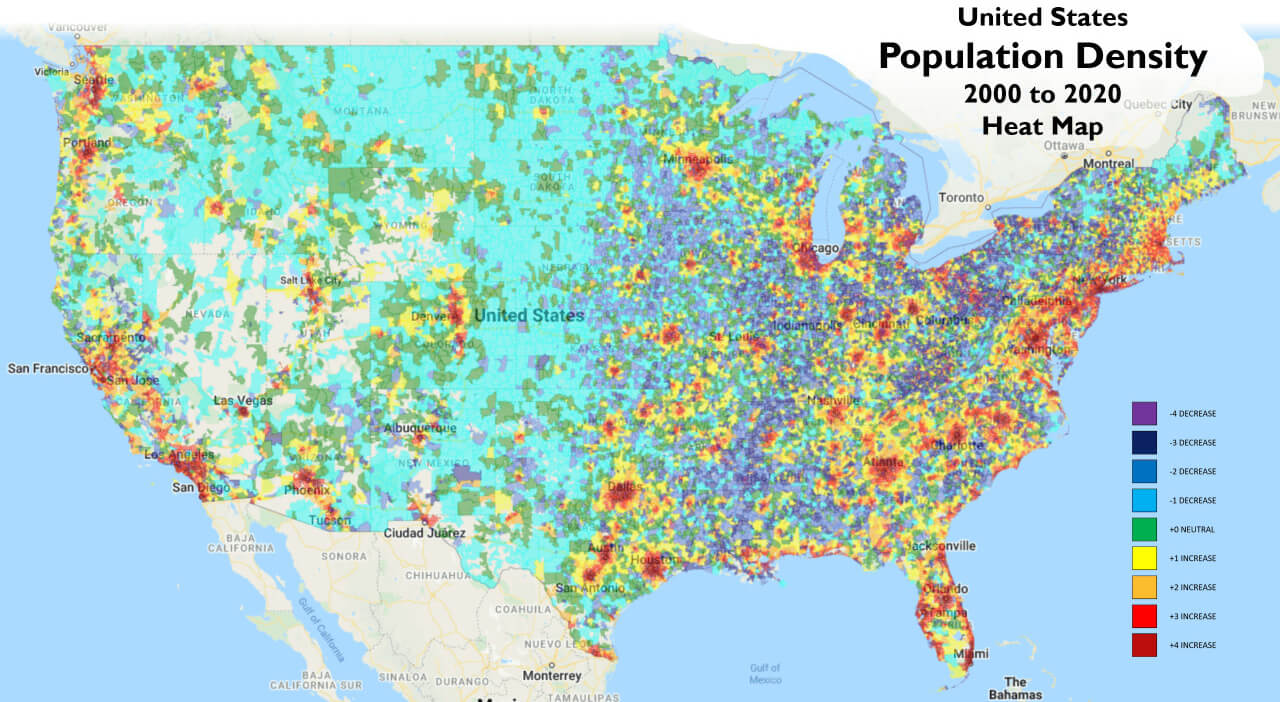 U.S. population density heat map (2000-2020) showing changes in density by region.
The U.S. Population Density Map by Block Level
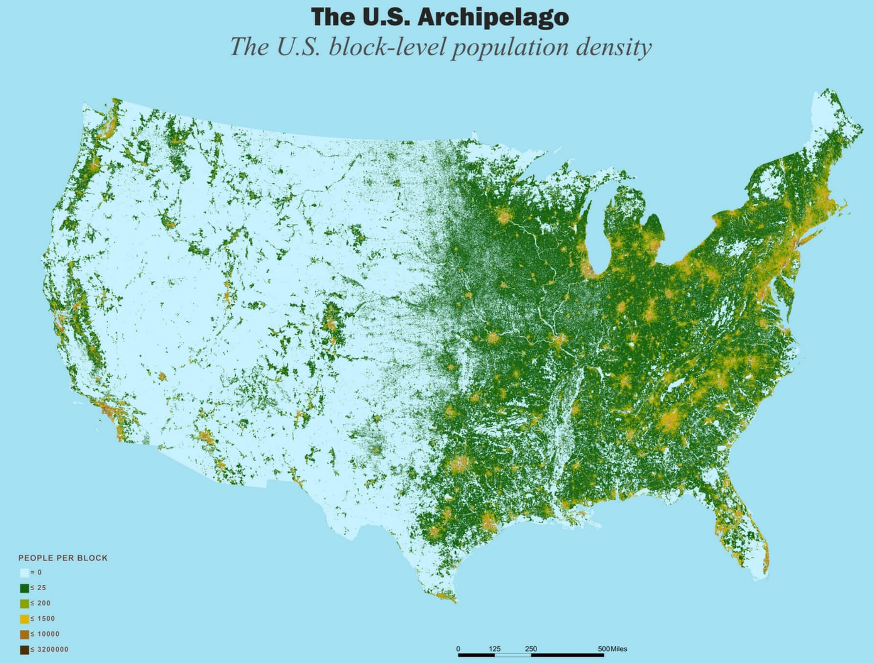 U.S. block-level population density map showing people per block.
Population Density Map of the United States and Canada
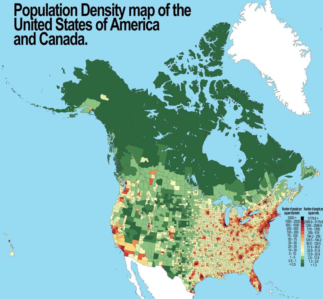 Population density map of the U.S. and Canada, color-coded by people per square mile.
Global World Countries Population Density Map by Country (2006) with the US
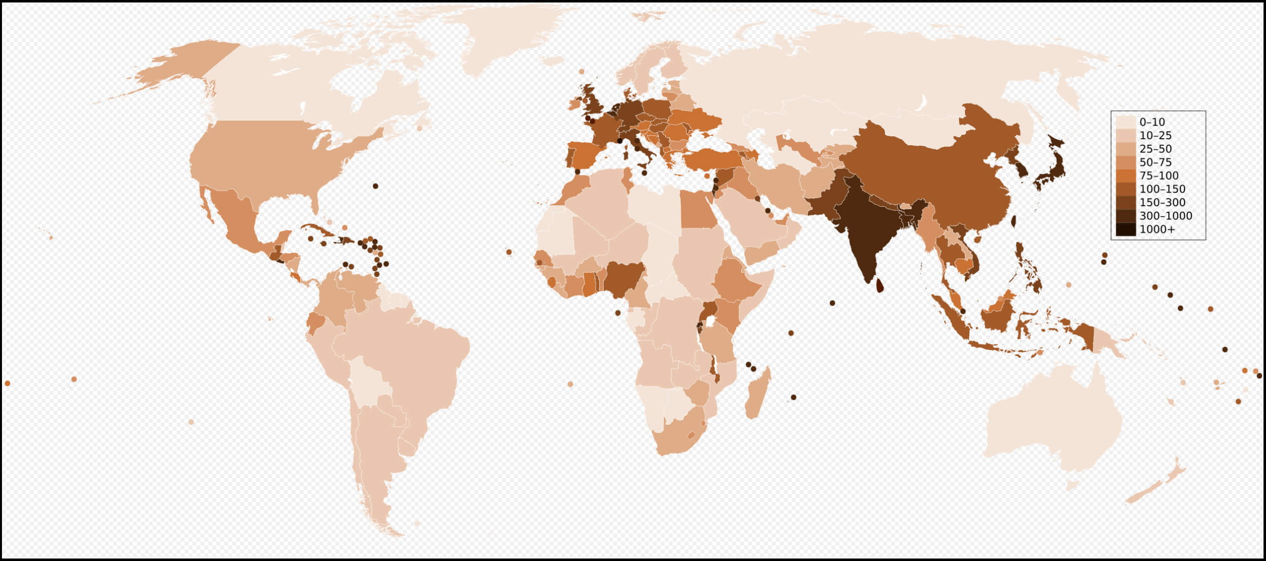 2006 population density map by the World countries with the United States, showing density levels from low to high.
World and United States of America Living Population Density Map by Country
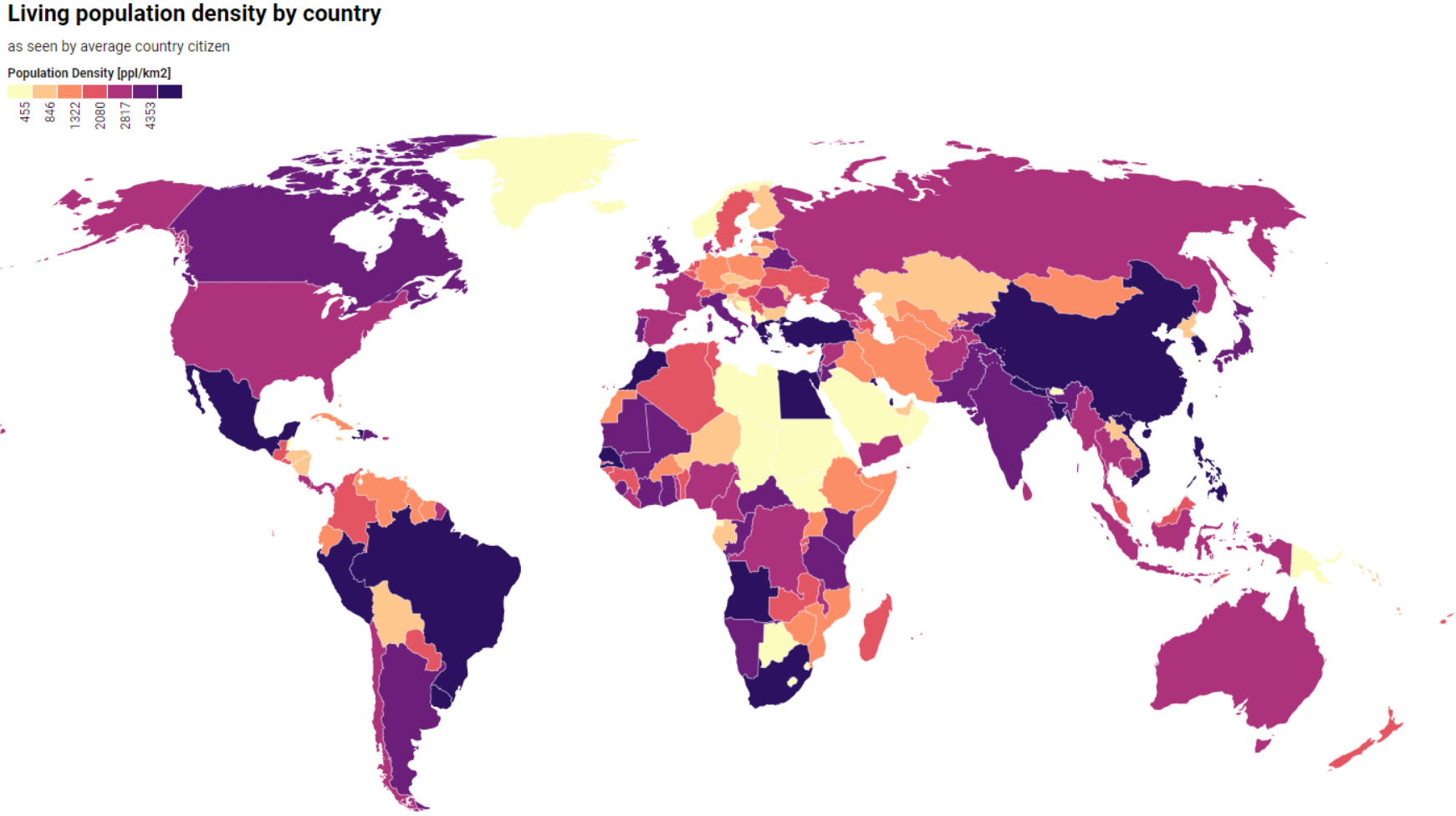 World and USA map showing living population density by country, color-coded by density levelss
The World Population Density Map Including the United States
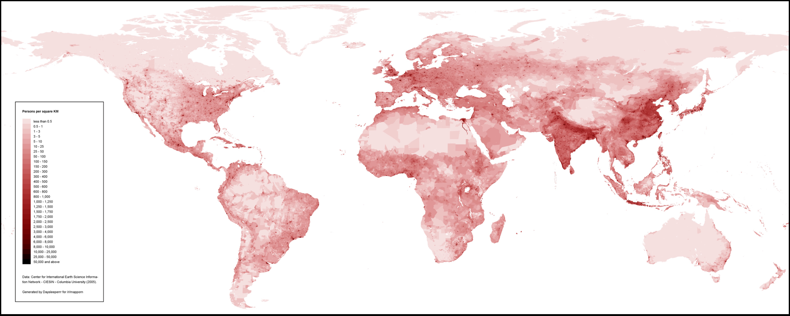 World population density map with the United States, shaded from light to dark red by density.
Median Age Map by U.S. County (July 2022)
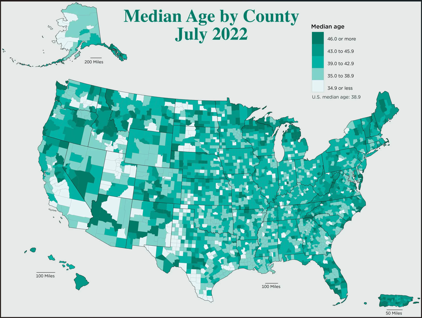 Map of median age by county in the U.S. for July 2022, shaded by age groups.
U.S. Counties by Population Growth
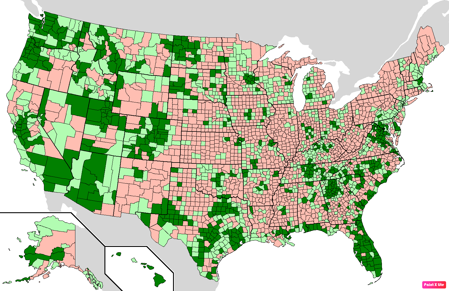 Map of U.S. counties showing population growth trends, with growth marked in green shades.
U.S. States Residents Population Map in 2018
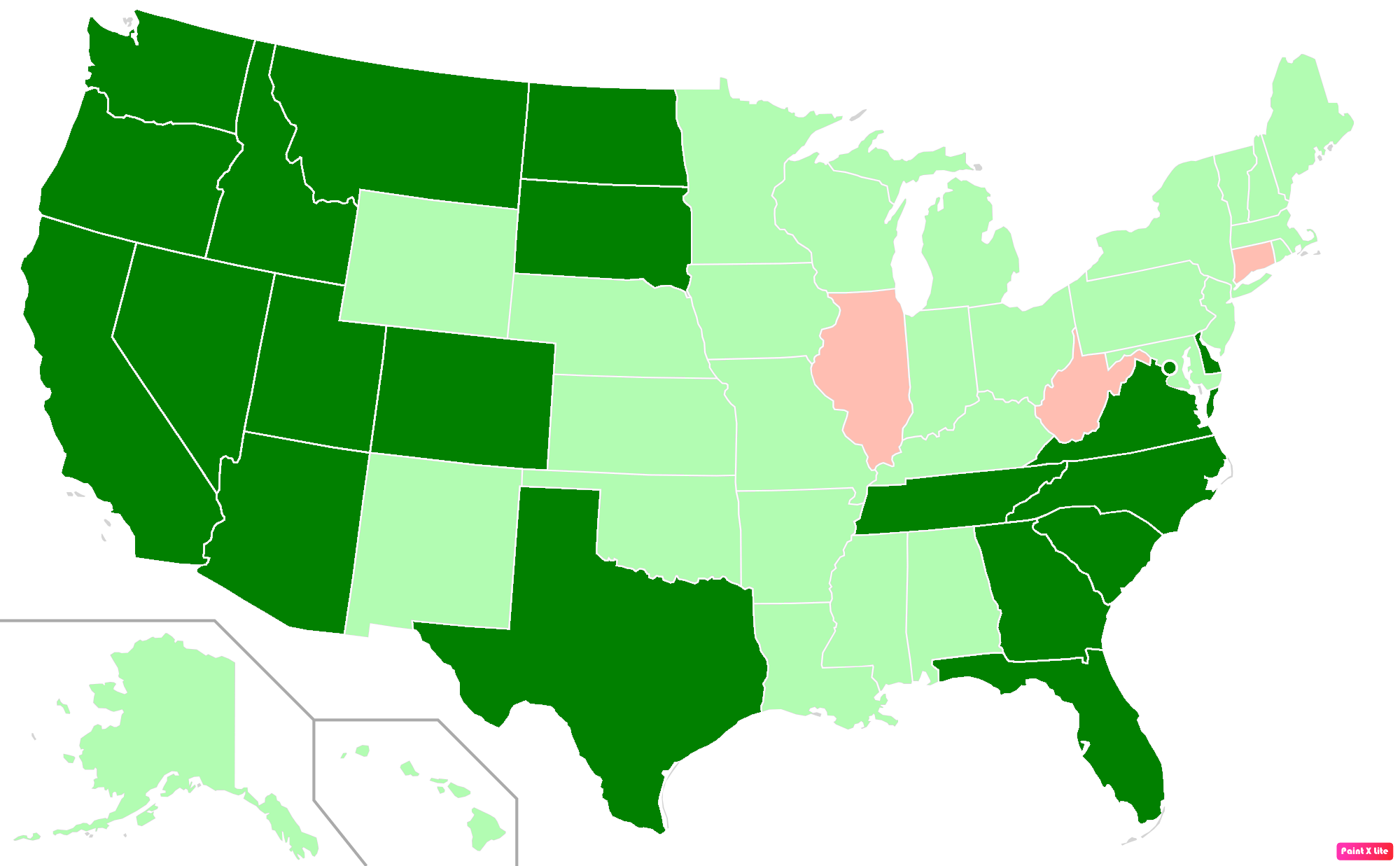 Map showing U.S. states by resident population in 2018 with color-coded differences.
U.S. Population Under Age 18 by County (2020 Census)
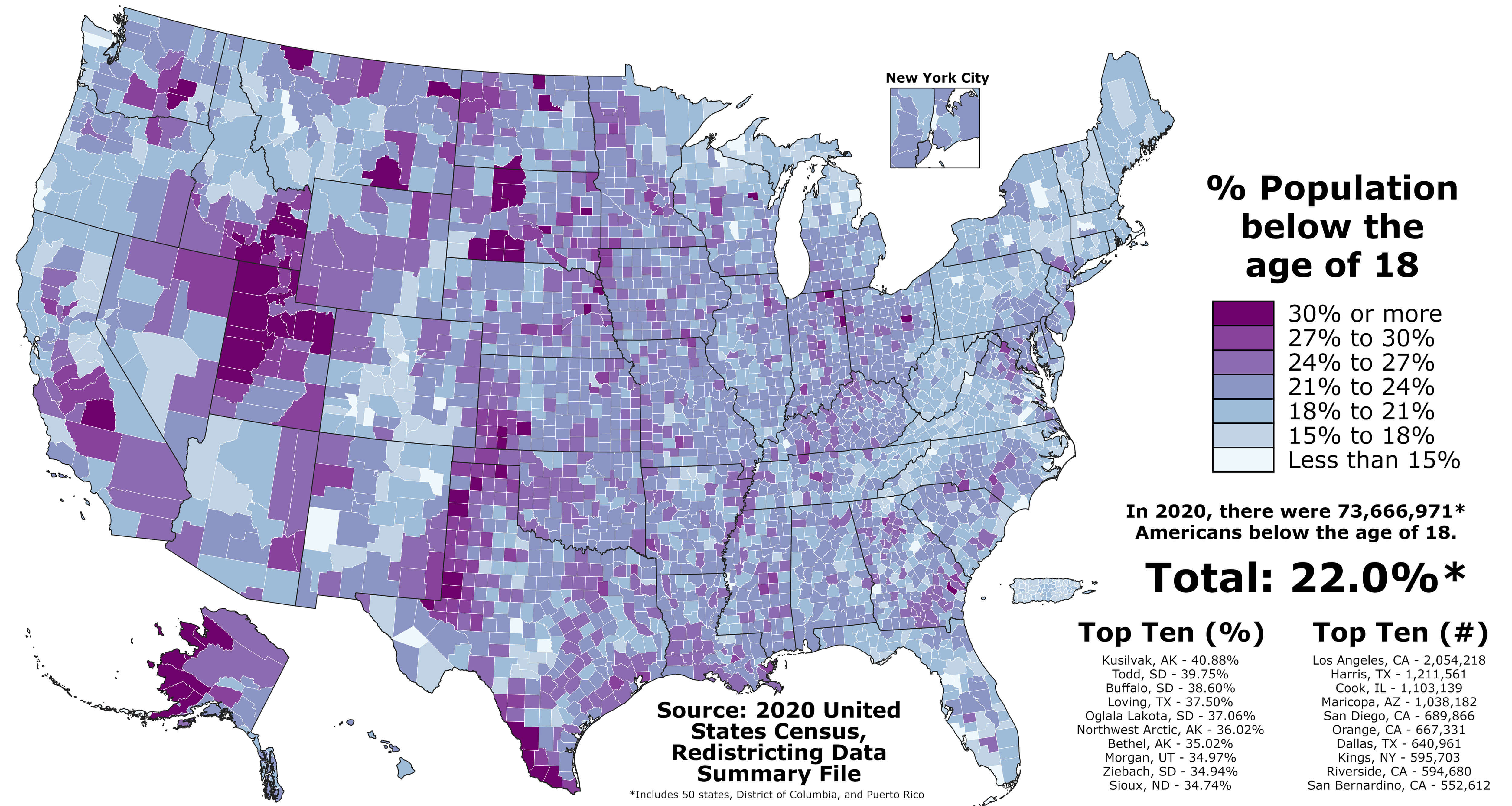 Map showing percentage of population under 18 in U.S. counties based on 2020 census data.
Age Distribution of U.S. Population 65 and Older vs. 17 and Younger by County (2020)
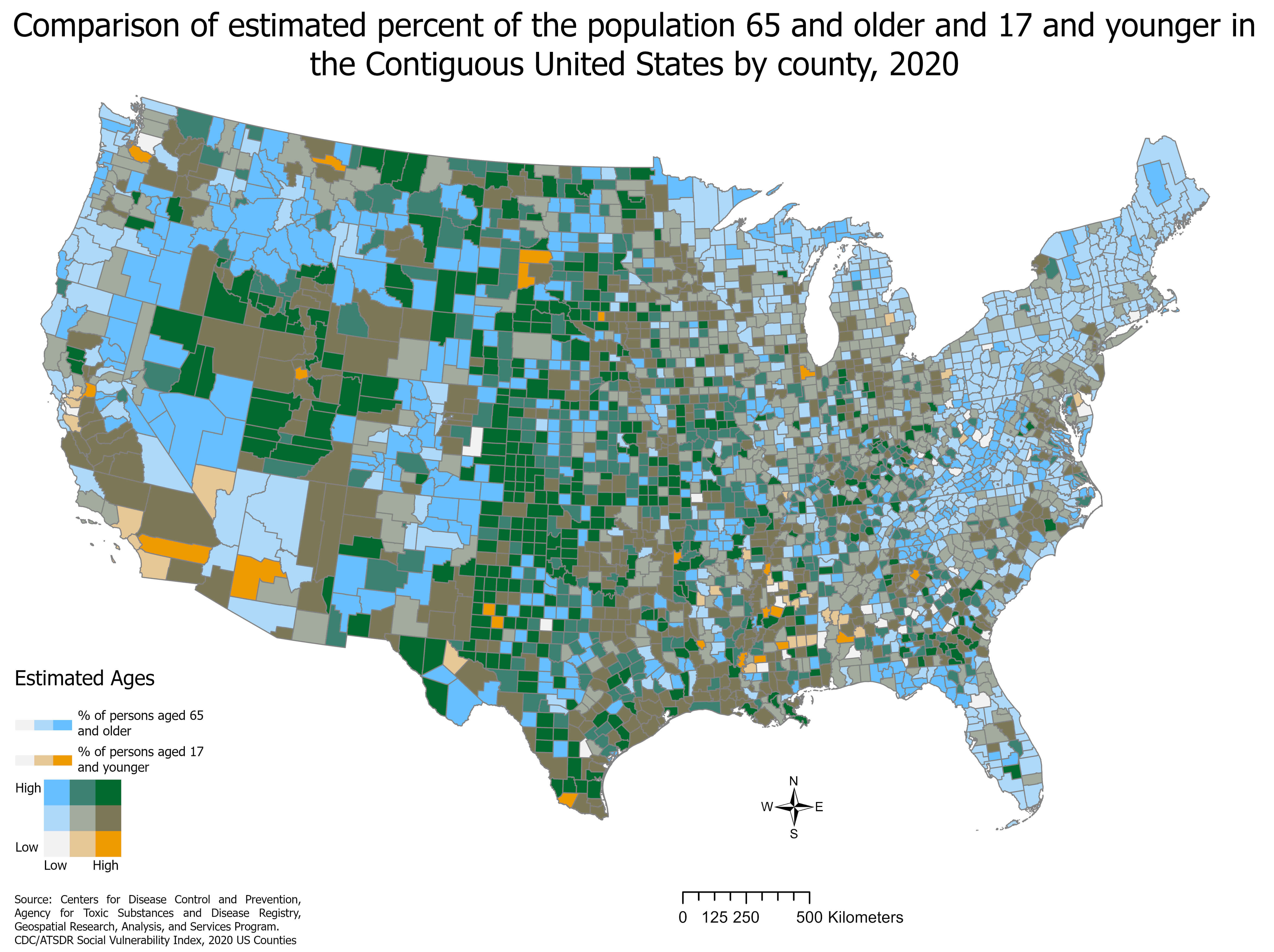 Map comparing population percentages of those 65+ and under 17 in U.S. counties (2020).
U.S. Population Density by Square Kilometer (2010)
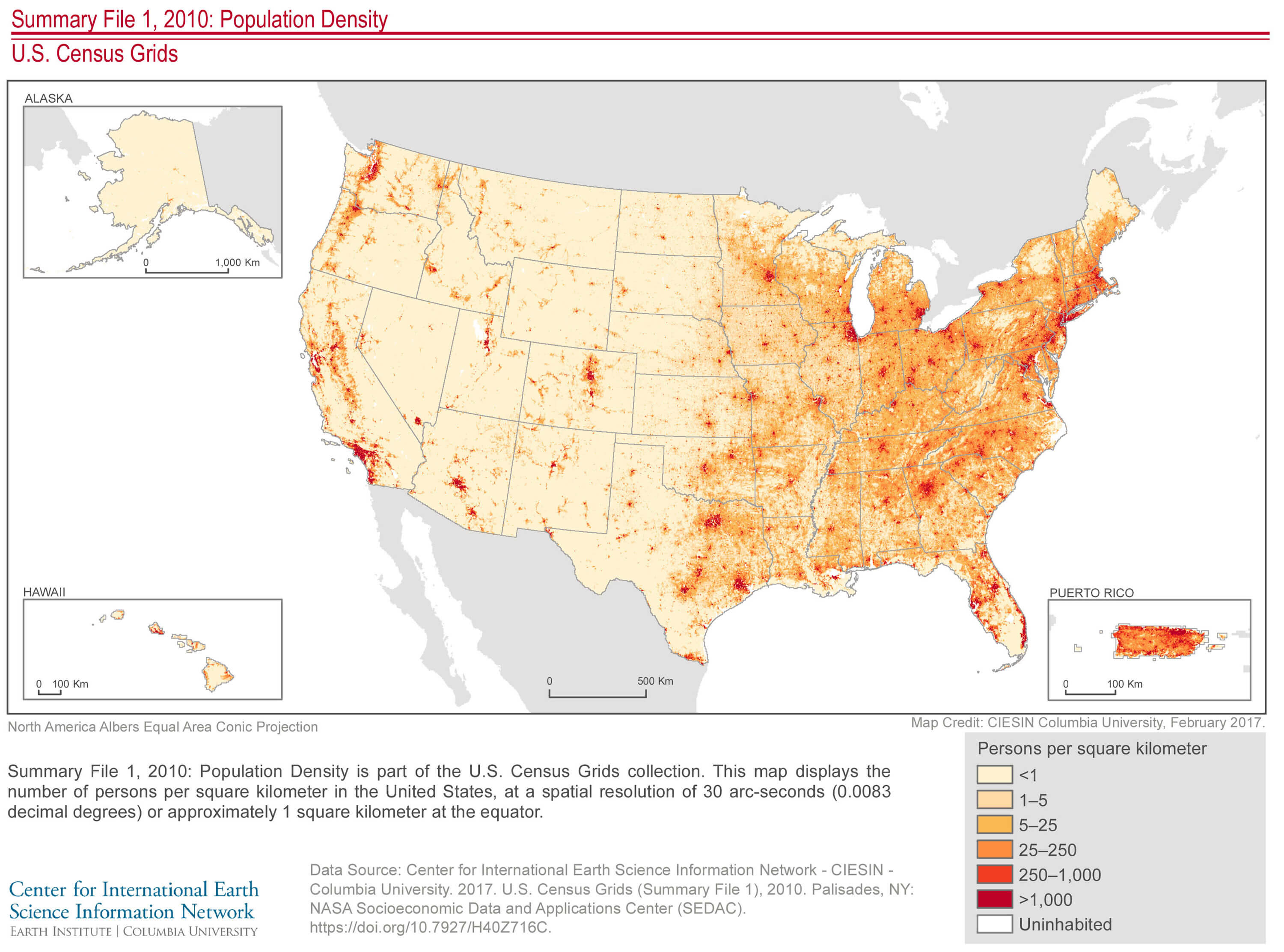 Map of U.S. population density per square kilometer based on 2010 census data.
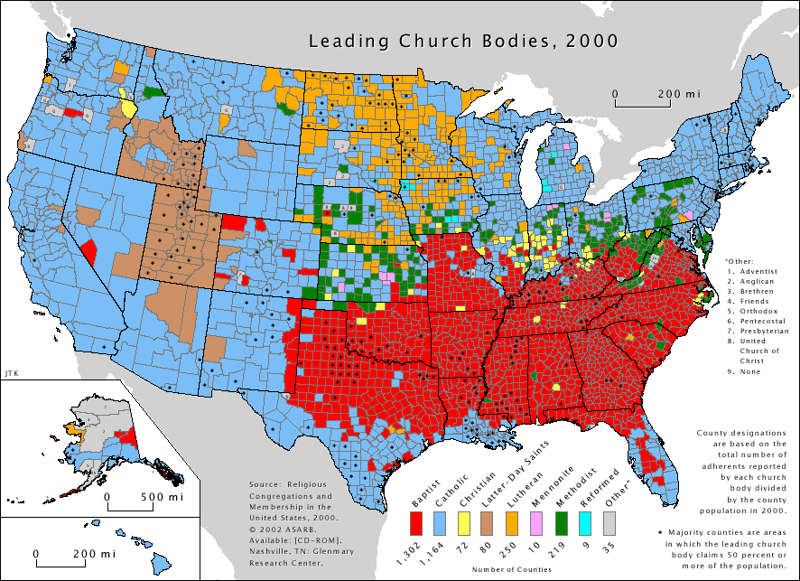
Religious Denominations Across the United States (2000)
 Map of the leading religious denominations by county in the U.S. as of 2000.
Catholic Population Distribution in the United States (2000)
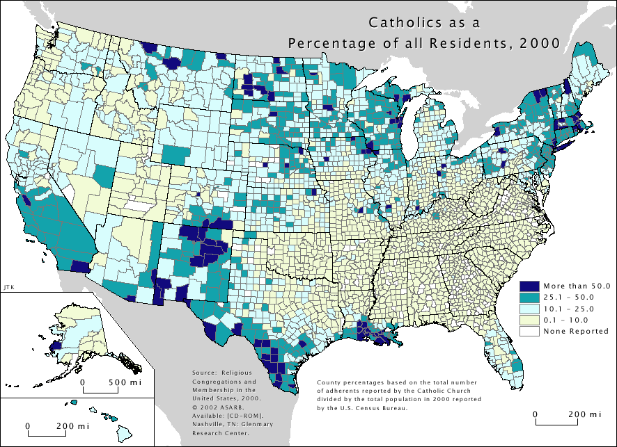 Map of Catholic population percentage by county in the U.S. as of 2000.
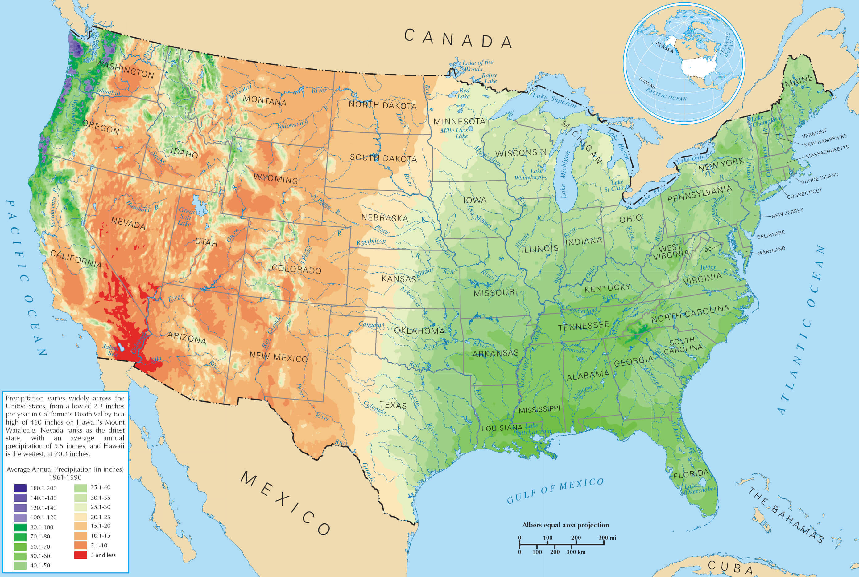
Annual Average Precipitation Across the United States
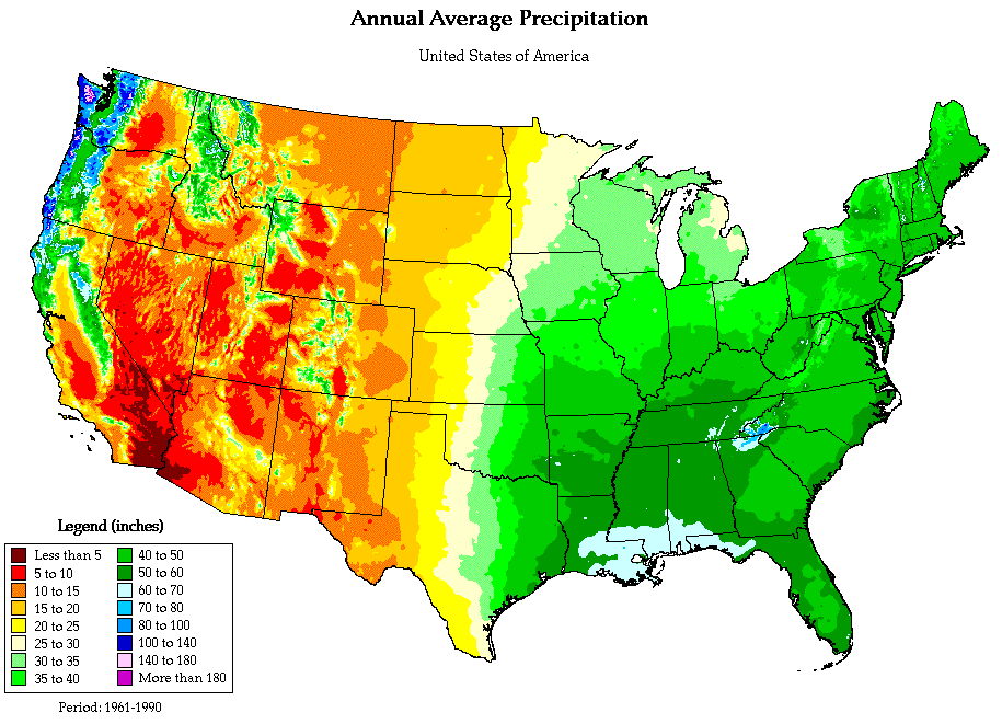 Map of annual average precipitation in the U.S. with varying intensities by region.
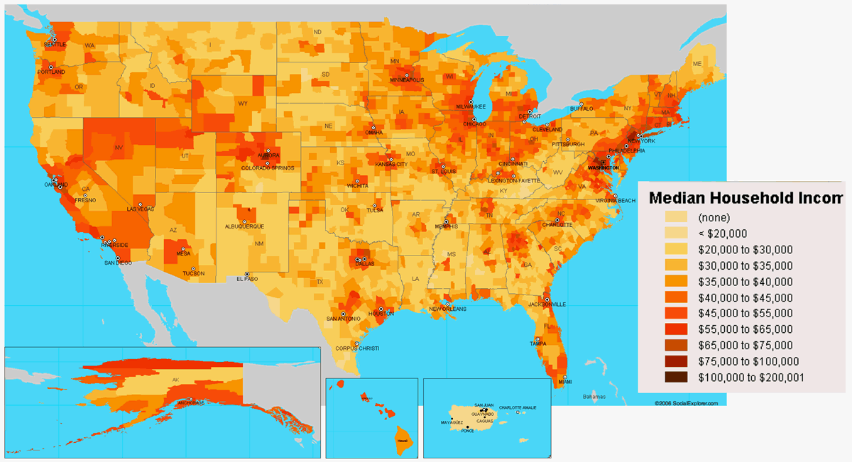
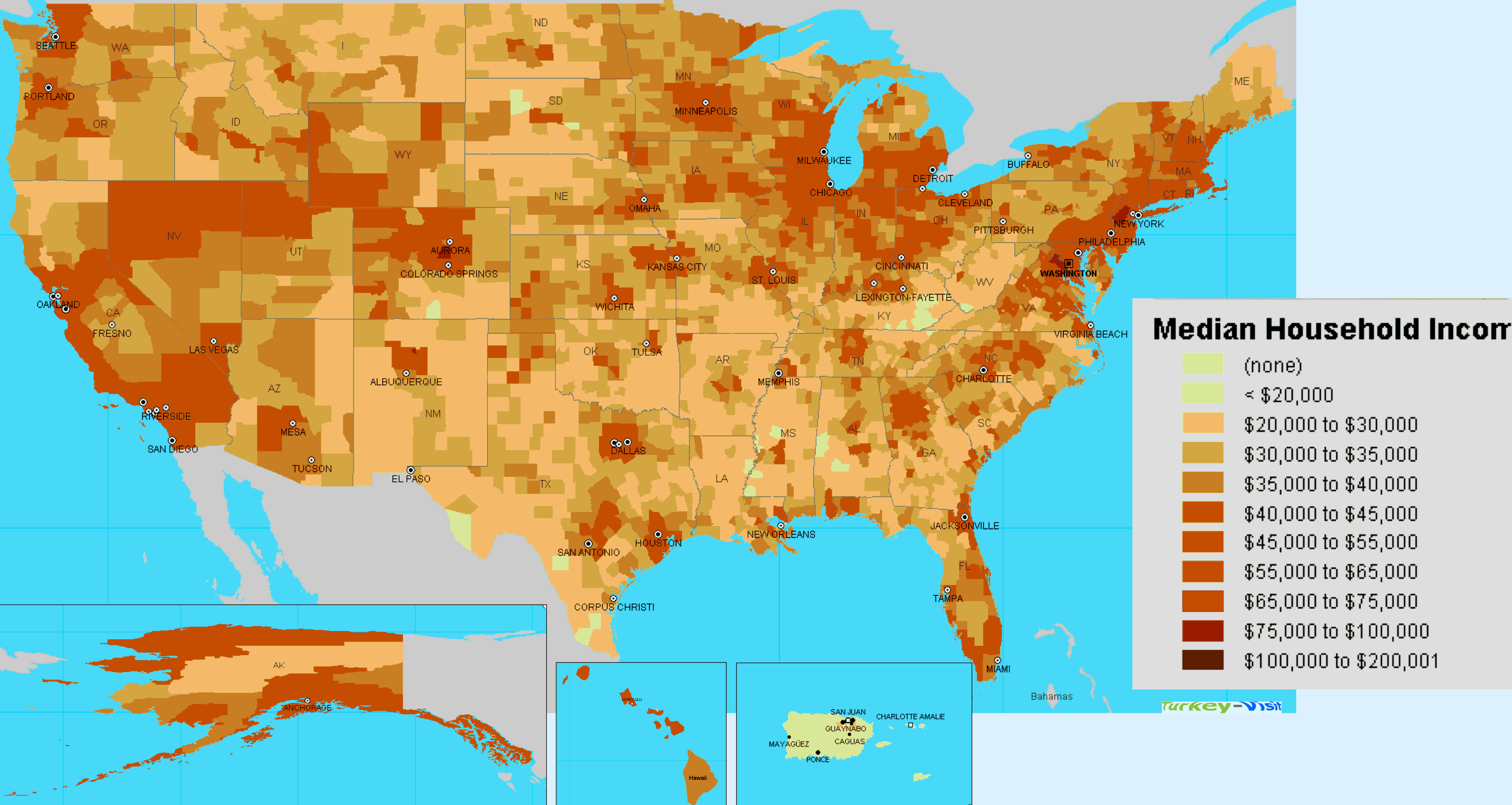
Median Household Income Across the United States
 Map showing median household income by county in the United States.
Please also view the following pages
- Michigan Ancestry Largest Population Map
- Michigan Population Map USA
- Ohio Demographics and Population
- Pennsylvania Population Map USA
- Population Density Map of Illinois
- Florida Population Density Map
- New York Population Map
- New York Population Ethnicity Map
- Texas Population Map United States 2010
- The population density of California Map
- USA Population Transportation Physical Map
- United States Population Land Height Map
- United States Population Density Cities Map
A collection Map of United States
"Free Printable High Detailed United States Map with States
Please subscribe on "World Guide" channnel on Youtube at youtube.com/c/WorldGuide
Author: Arif Cagrici- Head of Performance Marketing
- Head of SEO
- Linkedin Profile: linkedin.com/in/arifcagrici
- Head of Performance Marketing
- Head of SEO
- Linkedin Profile: linkedin.com/in/arifcagrici
Google Map, Street Views, Maps Directions, Satellite Images
WorldMap1.com offers a collection of map, google map, atlas, political, physical, satellite view, country infos, cities map and more map of .

